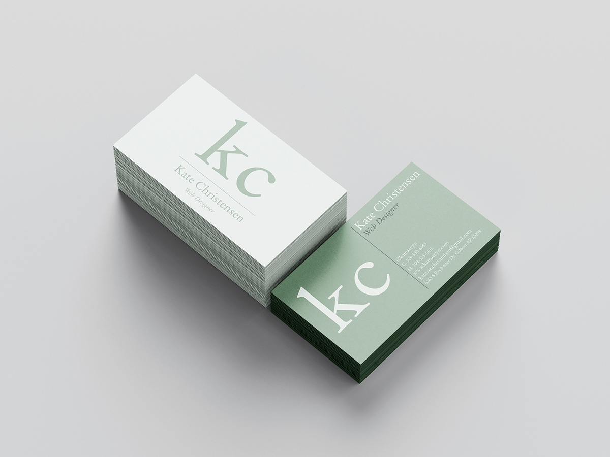
This is a digital mockup of my business card design. I tried to convey simplicity and professionalism in my choice of fonts and colors.
This project focused on the use of typography as a focus of graphic design. There are inherent challenges in limiting yourself to only typographic elements, but then there are also benefits. The difficulty of finding an eye catching design is outweighed by the simple beauty of a typeface just being what it is. The unique curves and stems of each typeface tell a story all on their own without the help of any pictures.
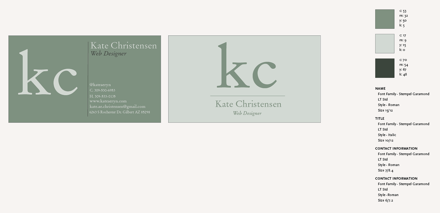
This is the style guide for my business card. I detailed the colors, and font specifications that were used in the design.
